Tab Colors in Azure Data Studio
If you’ve ever worked in Azure Data Studio, you may find tab colors very useful.
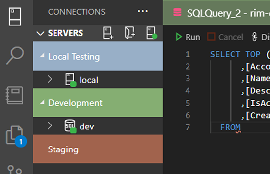
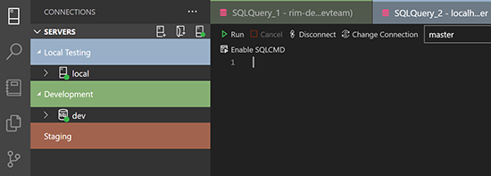
They allow you to visually separate different connections to development, staging, and production databases. Better visual indicators mean less opportunity for errors and mistakes when running queries. Below is an example of what you can accomplish using this feature.
Why the post?
As a documentarian, I don’t work with Azure Data Studio daily. But I still write about it. In addition, one of our backend developers recently introduced me to the Feynman Technique. Solid advice for anyone to follow.
Typically I go through all steps when documenting a process. My thinking is that I’ll better understand and explain new features and functionality. In the meantime, I get to keep learning!
So as I normally do, I set out to create these tabs.
My first step was to read the Azure Data Studio documentation. Microsoft’s Docs are usually a dream resource. However, I soon found myself struggling a bit. I operate under the basic assumption that I’m usually at fault, but maybe a more thorough explanation could benefit others as well.
Let’s set up the tabs!
A critical point to remember is that connections have to be organized into server groups.
-
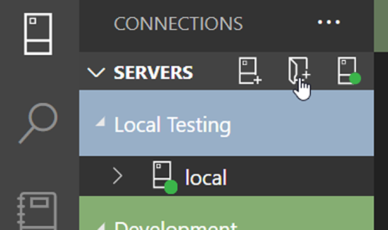
Click the New Server Group folder to create.
-
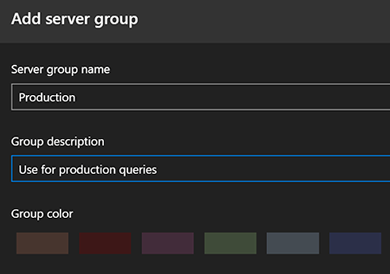
Add the Server group name, Group description, and Group color. Click OK.
-
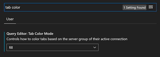
Go to File > Preferences > Settings.
-
Search for tab color.
-
Enable Tab Color Mode. I used the Fill setting.
-
Drag your server connections to the appropriate server group.
-
And voila! The next time you create a query, the query tab will take on the color of the server group.
By the way, if you ever want to get fancy and modify the color palette, you can:
-
Go back to File > Preferences > Settings.
-
Search for color.
-
In the Data > Connection section, modify the
settings.jsonto reflect your color choices.