UX Writing Lessons for Technical Writers
As a technical writer, I create software documentation. But many times, I find myself looking at in-product copy and wondering about content design improvements. Sometimes my instincts are spot on, but I don’t always know why.
Recently, I finished the UX Writing for Technical Writers certification course offered by the UX Content Collective. It’s a great way to learn more about UX writing and the logic behind content design.
I preface the rest of this post with a disclaimer — UX writing is an art form in itself. I’ve just skimmed the surface and I’m not an expert. But by taking this course, I walked away with some key takeaways.
What is UX/UI writing?
UX writing is the discipline responsible for creating UI copy or in-product text that guides users and helps them to interact with software applications. It’s part of the design, peppering text around menus, buttons, labels, tooltips, error messages, microcopy, modals, and instructions.
This is where the role of the technical writer overlaps with that of the UX writer. Docs aren’t always part of the product. But when done well, they can provide contextual help that blends seamlessly with the software. Users can see help exactly when needed, without switching between tools. In addition, many UX writing principles can serve to guide documentation efforts. And if you care about words and your users, you’re always looking at screen text with a critical eye.
UX writing principles
The course introduced me to several UX writing principles I hope to remember when writing documentation or interface text.
Provide the right content, to the right user, at the right time — Instead of reactive, user-initiated guidance, aim for proactive teaching opportunities that don’t rely on the user to seek them out. Think tooltips, microcopy, and instruction text inside a product interface.
Think like a friend, talk like a coach — Be patient, build trust, and explain as simply as you can. Write for humans, not machines.
Reduce friction at every step — Anticipate potential questions and eliminate doubt and worry. As a goal, keep the user moving forward with confidence. Don’t worry about talking down to less-experienced users. Advanced users can skip what they already know.
Communicate with clarity — Use plain words and customer-centered language, not corporate speak or unfamiliar jargon. Create scannable content with good information architecture and hierarchy. Use white space.
Proactively prevent errors and confusion — UX writers can think about reducing cognitive load and ensuring logical task flows and progressions throughout an experience. As technical writers, we can also educate users without exhausting them. We can think about providing searchable content and preventing in-depth troubleshooting that requires multiple steps or actions.
The importance of voice and tone
Voice is the gut feeling a person has about your product or organization. Tone also conveys mood but is contextual, varying on the situation and audience.
To help illustrate the importance of voice and tone, here’s a good example I borrowed from the coursework. Consider the first variation of this sentence:
Testing app functionality for an external vendor can be time-consuming. To employ more advanced methods of app debugging, use our JavaScript API.
Then look at its less wordy, more friendly, more human counterpart:
To quickly find out whether your app works with third-party software, use our JavaScript API.
Company or brand voice defines your organization’s personality, and it can help you choose between the previous two examples. Companies like Intuit and Shopify develop content design guides that outline voice and tone while creating a unified strategy for the entire organization.
To be consistent, documentation and in-product text should reflect the company’s brand voice and tone. When you aim to use a shared vocabulary, your users can make better connections. There’s less room for friction or confusion.
While voice remains consistent throughout all experiences, tone can differ depending on the purpose, audience, or situation. For example, are you trying to:
- Engage the user emotionally?
- Give the user clear instruction?
- Reassure the user or boost their confidence?
Tone maps
If we look at documentation through the tone lens, it focuses on helping users to achieve technical or complex goals. It’s not trying to provoke emotions. The writing should be clear and helpful. Using the same voice and tone as marketing content may not be suitable.
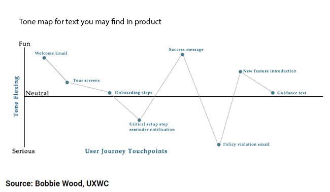
To better understand tone and its relationship to content, I found the following tone maps beneficial. The first image outlines tone flexing for UI text found in product messaging. Here we see how tone varies for welcome emails, tour screens, onboarding steps, reminder notifications, success messages, policy violation emails, etc.

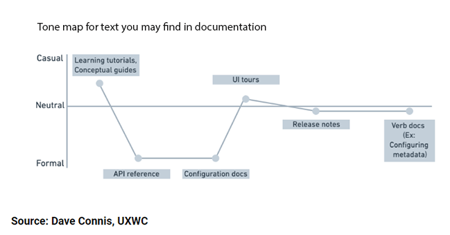
The next image relates to tone dimensions for different areas found in documentation. In general, the tone in documentation is more neutral, focusing on getting users the help they need to be successful.

For more information about tone, see The Four Dimensions of Tone of Voice.
The final takeaways
There’s so much more to UX writing, and I’ve only briefly mentioned what this course offers. If you’re a documentarian who wants to learn about writing for UI components, creating style guides, using research techniques, conducting content audits, participating in usability testing, and much more, I encourage you to use UX Content Collective as your gateway.
And now for the final takeaways…
- Evangelize for consistency.
- Think about your audience and ease pain for users. Be their advocate.
- Use progressive disclosure. Don’t pile on too much, too fast.
- Use text that’s short, simple, and to the point.
- Think about voice, tone, vocabulary, and speech patterns.
- Think about accessibility.
- Remember that words can make or break an experience.


