Using CSS filter: invert() for low-vision accessibility
eBroker Software’s, Ritter’s Affordable Care Act (ACA) Marketplace Quote Engine, login portion was slated for a UI refresh. One of the challenges we faced was an agent that is legally blind. The agent handles nearly all of his business from his desk. Iterations of eBroker’s backend, formerly Agency Central, had a few interesting font and styling choices which were attributed to the agent’s eyesight.
Enter Low vision mode
filter: invert()
CSS filters have handled most of the heavy lifting for our agent. We set a low-vision switch in eBroker’s user profile, and attached a low-vision style sheet when the preference is enabled.
Straight Sass HSL functions were another option here, but it was less work overall to call filter: invert(100%), then touching each element with background: invert($color), or similar. We may revisit with straight Sass in the near future as filters have to be enabled manually in IE Edge? The agent we worked with uses Firefox as his dedicated, all things RitterIM, browser, so filter was the fastest way to achieve much of the work.
body {
  filter: invert(100%);
}
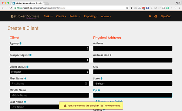
Seriously, css filters are amazing. You can see how much of a difference below!
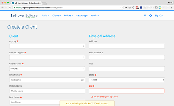 {: .ui.fluid.image}
 {: .ui.fluid.image}
I still can’t read those tiny fonts?
So we increase our font sets based on a percentage, and checked with the agent. They still found it hard to read “those really skinny fonts”. So based on feedback, the font-weight was increased as well. bold works unless you’re targeting a specific weight supported in your web font, i.e. 700.
Why even mention font weight? This would have been missed entirely if we hadn’t been working with the user directly. You can’t develop a good user experience without the user!
$low-vision-font: 125%;

body {
  filter: invert(100%);
  p {
    font-size: $low-vision-font;
    font-weight: bold;
  }
}
Flash messages
The invert filter inverted everything, but we wanted our flash messages to stand out as they normally would. So we invert a second time, along with additional padding and our increased font size.
Remember, initial styles have already been called, we’re just overwriting here to invert back to our original flash coloring.
We also added icons here. Our normal mode relies on alert coloring alone. The icons become useful when your not entirely sure your user can see the actual message.
.bg-error {
  filter: invert(100%);
  font-size: $low-vision-font;
  padding: 0.7em 0;
  margin: 0.7em 0;
  &:before {
    content: "\f071";
    font-family: "Fontawesome";
    color: inherit;
    padding: 0 0.5em 0 1em;
  }
}
Result
There were a few other minor styling changes to add contrast, but you get the idea. One of our apps is now enabled for low-vision, and we’ll be looking to expand other accessibility features as we move forward.