Building a better blog; an experiment in UI and UX
Our initial blog had some nice features, but really didn’t do anything to place our content first. Was it really important that our logo be prominently placed? Not really, we’re developing products to support Ritter Insurance Marketing and this is a department technical blog. So we set out to dial down the noise and bring focus to our content.
The article should have your sole attention
 {: .img-fluid .border }
The hamburger menu - gone. If you’re visiting on mobile, chances are you got here from a link, which means you’re interested in the article. As you move down the article, it’s just content.
Some of the other standards have worked their way in - how long will it take to read, and how fresh is the content?
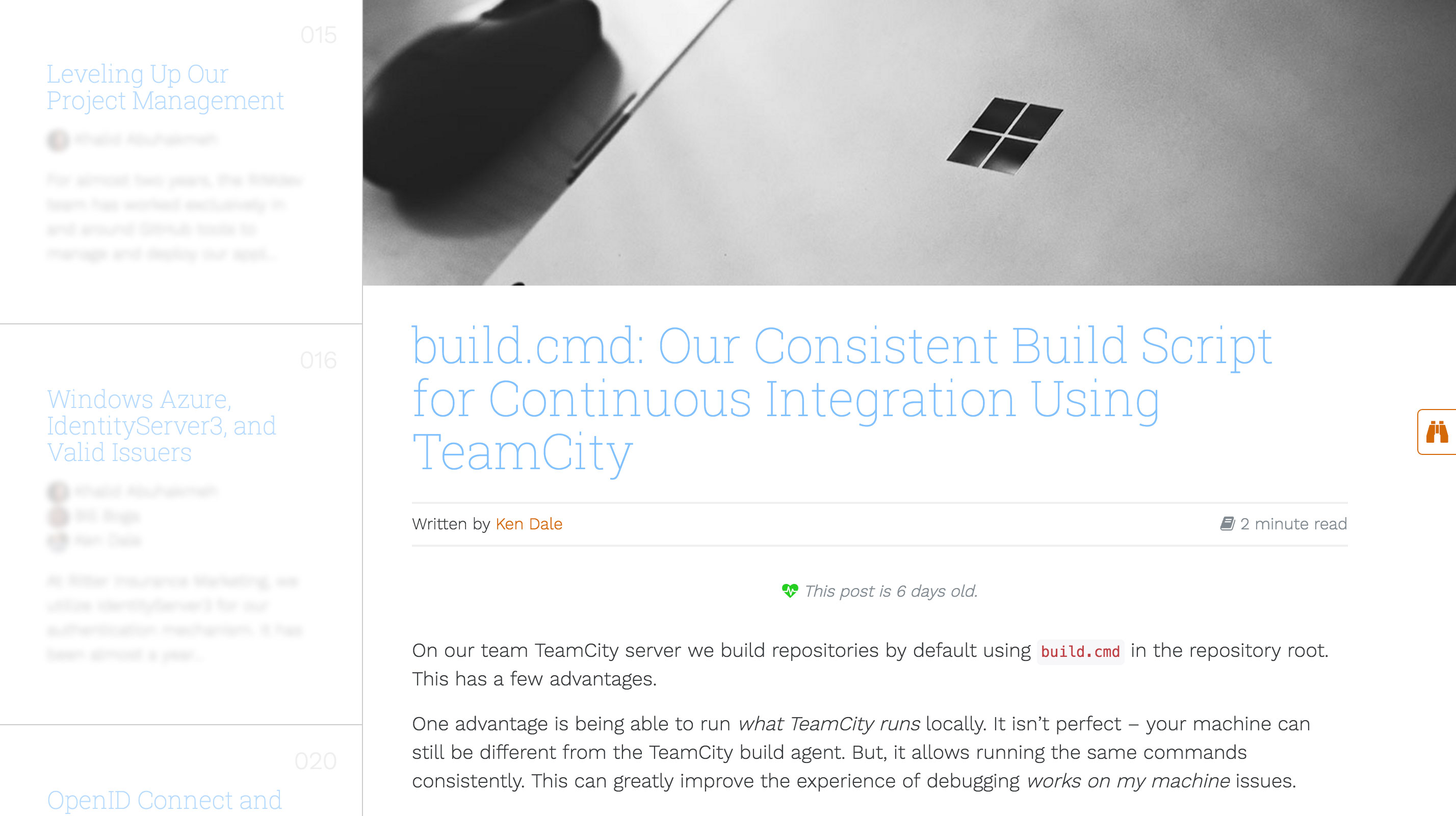
If you’re visiting on a tablet or larger, you start to see another layer of content/navigation. The 10 most recent article appear as a sidebar. We still want your attention on the article, so content other than a headline is blurred until you hover.
How do I move around?
Once you reach the end of the article, you’re presented with related articles (if we can find any based on tags), else you’re given the previous and next articles for additional reading. You can also explore content by tags, author, or click the binoculars to bring all articles into focus.
Curious about who we are? As you move back up the article, a footer with light navigation appears. We just keep it out of your way while you’re reading.
What’s next?
We’re planning other features and looking for feedback? What do you think?