z-index Is Confusing, but It Doesn't Have to Be
For the longest time, I was guilty of thinking I knew how z-index really worked. I was mistaken. I never really took the time to research how it actually worked. I believe a lot of front end devs are guilty of the same thing when they’re starting out. If we want an element to stack above another we use z-index. Simple, right? Give it a little z-index. Wait, why didn’t that work? It needs to be higher. Really high, in fact. Let’s give it z-index: 999 yeah that ought to do it. Not necessarily.
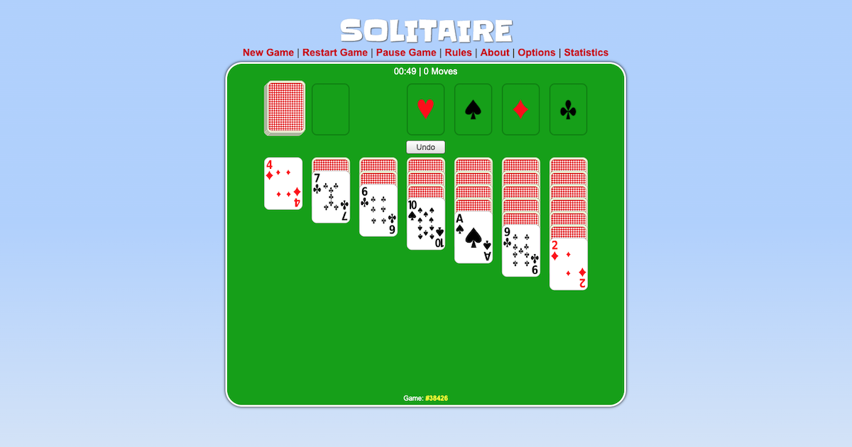
Maybe, most importantly, we should first understand the default stacking order of elements, even without a specified z-index. Simply put, elements are ordered from bottom to top. So the next sibling element in the dom will stack on top of the previous. Think about it like solitaire. When you deal out the cards, the first is laying on the table. As you find relevant cards, you place them next, and on top of the previous card.

Ok, that’s great that we got that out of the way, but let’s get to examples of those times when we have an element that needs to be stacked over another and z-index: 9999 is not cutting it.
I think the problem occurs most of the time when you have specifically positioned elements throughout the page. Maybe you have a fixed header or an aside text block with absolute positioning. Layouts like this can make for a complicated stacking order along the z-axis because defined position values, other than position: static, affect the stacking order. Position values like fixed and absolute, remove elements from the order of the dom, which can add to the complication of z-axis stacking.
Without any specified z-index, the default stack occurs as previously mentioned. If any element in the stack receives a position value of absolute, relative, or fixed, that element will appear on top of the stack, or closest to the screen, so to speak.
For example, say we have a site with a flyout in the header. To keep it simple, nothing on this page has a specified z-index value.
See the Pen z-index layout -1 by Ted (@PhiloBeddoe) on CodePen.
When the flyout is open, it appears over the container below even though it doesn’t have a z-index value. This is because, to position the header flyout absolute to the parent header, it’s best to give the header a position: relative. Now that the header has a specific position value, the stacking order changes. So the flyout wins and displays on top of the page.
Say we want to add a side block in the container below and, for argument’s sake, we need to position it in the top left corner of its parent container. In order to do this, we should add position: relative to the container.
See the Pen z-index layout - 2 by Ted (@PhiloBeddoe) on CodePen.
Now we have two elements with specified positions so, the last positioned element wins. In this case, it’s the container with position: relative. But now our layout is broken. Now we should add a z-index value to the flyout.
See the Pen z-index layout by Ted (@PhiloBeddoe) on CodePen.
We give the header flyout a z-index: 1 and the stacking order changes again.
Nested z-index Values
The stacking can get really confusing when you have nested components that have specific z-index values.
See the Pen nested components - 1 by Ted (@PhiloBeddoe) on CodePen.
In the example above, we have an aside that contains two blocks. Both of which are positioned absolute. The side block is positioned absolute as well and is a sibling of the aside. The side block has a z-index: 5 and the aside has z-index: 1. I can’t think of a good reason why this would be, other than it helps me get my point across. So just go with it. Because of these values, you can see that anything inside the aside will not stack above the side-block no matter how high you make the z-index.
I think this is where most devs get really confused. This is why we see code in our css like:
.example {
  z-index: 9999;
}
Again, the higher the z-index the closer in the stack. Yes. As long as the higher z-index is on the right element. In the example above, there are a couple of fixes we could do.
We could remove the z-index from the aside. This would make the z-index: 20 on the .block-1 take effect and stack .block-1 above side-block.
Increase the z-index value of the aside. As long as it is greater or equal to its sibling, in this case, .side-block, then we will get the desired stacking order.
See the Pen nested components by Ted (@PhiloBeddoe) on CodePen.
I think we let z-index be overly complicated because we don’t truly understand how it works. To this day, I am still humbled by z-index sometimes. You can give something a huge z-index value but, without a position other than static, the stack won’t change. The deeper the nesting in the dom, and the more elements positioned differently on the page, the more complicated the stacking order can be.
I hope this helped. Good luck z-index-ing.
For another great post on z-index, check out Pavel Pomerantsev’s Smashing Article.


