Recreating the Spotify "Like" Button
Recently a fellow team member challenged me to recreate the new Spotify “Like” button using only CSS. Honestly I’m not sure if he challenged me necesarily, but posed the question “can you pull this off with css?” - that was enough for me.
Breaking down the animation
The Spotify Like button has a few neat animations happening:
- Before liking a song, it looks like a traditional heart shaped icon, with a white outline and transparent fill.
- Upon liking a song, several smaller hearts seemingly explode out of it and float upward.
- A green circular pulse emits from the central heart
- The heart icon itself fills in with the Spotify green color
- Unliking a song also has a small animation of the heart icon shaking and reverting back to the white outline and transparent fill.

Getting started
I did a quick search for a simple heart shape SVG on Google and found a perfect option. Next I took that SVG and tossed it into Figma to make a few quick adjustments. Mostly just changing colors and including the extra “exploding” hearts in the SVG that we’ll later animate.
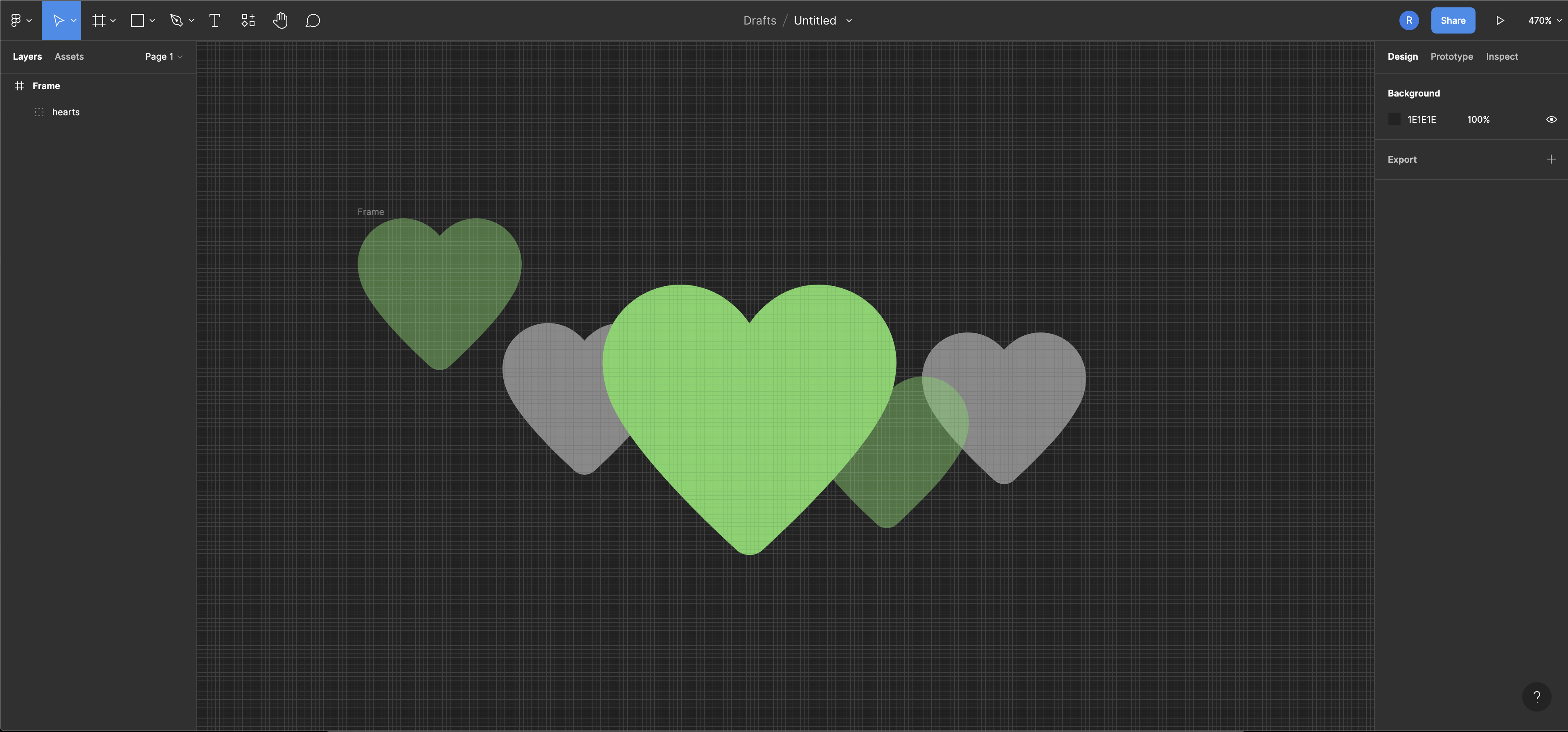
After grouping all relevant elements together, I used Figma’s incredibly useful copy to SVG feature to grab the SVG code and paste it into a new Codepen.
Note: I also converted the outline strokes of the SVG elements into paths.
HTML structure
I decided that since the goal was to not use any JavaScript, I would utilize the checkbox trick for managing the state of the like button.
<input type="checkbox" id="like" name="like">
<label for="like">
 <!--SVG Code here!-->
</like>
Including the SVG inside the <label> tag means that clicking on the SVG will check the checkbox!
Adding default CSS
For the default stylings of this Like button, there are a few things needed:
- The checkbox itself does not actually need to be displayed, so I hid it with
display: none. - The central heart needed a transparent fill and a white border.
- The smaller hearts don’t need to be shown yet either, however they will need to animate and set the opacity to
0.
The CSS sibling selector makes it possible to easily target the label that appears next to the input like so: input[type="checkbox"] + label. This is super useful in applying different styles to elements within the label when the input is checked versus unchecked.
input[type="checkbox"] + label{
  /* Unchecked styles... */
}

input[type="checked"]:checked + label {
  /* Checked styles */
}
Creating the animations
I ended up creating two keyframe animations and one transition to make this look nice.
Center heart
The center heart icon that user’s click utilizes a CSS transition to go from it’s unchecked to checked state:
/* Center heart */
input[type=checkbox] + label #center-heart #inner {
  fill: transparent;
  transition: 0.2s ease;
}
input[type=checkbox] + label #center-heart #outer {
  fill: white;
  transition: 0.2s ease;
}

input[type=checkbox]:checked + label #center-heart #inner {
  fill: #64d26d;
}
input[type=checkbox]:checked + label #center-heart #outer {
  fill: #64d26d;
}
This is great as it will reverse the transition when unchecking as well!
Exploding hearts
The exploding hearts required a percentage based keyframe animation to make the hearts visible, apply the floating effect, and then finally disappear again.
For the animation’s easing-function, I played around with a custom cubic bezier in-and-out type curve to make the animation a little smoother looking.
I did not want all the exploding hearts to animate at the exact same time though, so I added an animation-delay to those specific elements at various timings - just to mix it up a little bit.
/* Exploading hearts */
input[type=checkbox]:checked + label #left-hearts > *,
input[type=checkbox]:checked + label #right-hearts > * {
  transform-origin: center center;
  animation: floatingHearts 0.65s cubic-bezier(0.12, 0.84, 0.5, 0.44) forwards;
}
input[type=checkbox]:checked + label #right-hearts g:first-child {
  animation-delay: 0.3s;
}
input[type=checkbox]:checked + label #right-hearts g:last-child {
  animation-delay: 0.1s;
}
input[type=checkbox]:checked + label #left-hearts g:first-child {
  animation-delay: 0.2s;
}
input[type=checkbox]:checked + label #left-hearts g:last-child {
  animation-delay: 0.5s;
}

@keyframes floatingHearts {
  0% {
    opacity: 0;
    transform: translateY(10px);
  }
  50% {
    opacity: 0.5;
  }
  100% {
    opacity: 0;
    transform: translateY(-50px);
  }
}
Pulsing effect
The final animation I wanted to include was the pulsing effect that happens upon clicking the button. I did not need to create any other HTML or SVG elements for this, but instead utilized CSS ::before and ::after pseudo-selectors to create rings around the SVG. The rings would transform by scaling from 0 to 1 then finally disappear by changing the opacity to 0. For this I used another percentage based keyframe animation.
I utilized the same cubic bezier curve for this animation’s easing-function animation as well.
And similarly to the exploding hearts, I targeted one of the rings to have a slight animation delay to provide a slightly neater looking animation.
input[type=checkbox]:checked + label::before,
input[type=checkbox]:checked + label::after {
  content: "";
  display: grid;
  border-radius: 100%;
  position: absolute;
  outline: 25px solid #64d26d;
  height: 300px;
  width: 300px;
  animation: scalePulse 0.5s cubic-bezier(0.12, 0.84, 0.5, 0.44) forwards;
}

input[type=checkbox]:checked + label::after {
  animation-delay: 0.2s;
}

@keyframes scalePulse {
  from {
    transform: scale(0);
  }
  to {
    transform: scale(1.1);
    opacity: 0;
  }
}
Bringing it all together
After all the CSS is in place, clicking on the heart button should provide a great looking animation that is very similar to the one found in Spotify when liking a song.
Full code available on Codepen.
The animation I ended up was ultimately slightly different than the Spotify animation itself, however I think it still turned out nicely!