CSS Only Tooltip for All Screen Sizes
As we create CSS components in our internal framework, we typically try to use little if no JS. Our tooltips should be no different. We would leverage absolute positioning with a little help from the handy pseudo-elements we all know and love in order to get the result we needed. Here’s what we did.
We wanted to keep the markup light. So we created a tooltip that could be used with only one element. You could end up writing something like this:
<div
  class="tooltip-right"
  data-pui-tooltip="This is what our tooltips look like.">
  Tooltip
</div>
You might have noticed the data attribute, data-pui-tooltip. This is where the content for the tooltip will live. But how does it get displayed? A pretty awesome thing you can do with a pseudo-element is to use the value of a data attribute for the content. In this case, the CSS looks like:
[data-pui-tooltip]:after {
  content: attr(data-pui-tooltip);
}
Resulting in:
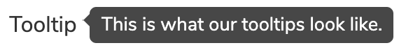 |
|---|
| Rendered tooltip |
We thought this was pretty cool. We created a tooltip that uses only CSS. No JS necessary. Plus, unlike other CSS only tooltips, ours requires less markup. You can literally make a tooltip out of one line of HTML. But what does it look like on mobile?
Since we’re using position: absolute to position the tooltip content, we run into problems on smaller screens. In our case, bugs begin to show up below the 768px breakpoint. Even if we set a max-width below this breakpoint it still wouldn’t cover every case. I’m sure we could have come up with an option using JS but we wanted to stay away from that. We also kicked around the idea of not showing a tooltip on mobile, because, let’s face it tooltips can kinda be a pain at smaller resolutions or on a mobile device. But our goal remained the same, to make a CSS only tooltip, and keep it in line with our responsive framework goals. We came up with a mobile-specific alternative which we think works really well.
We decided that on smaller screens it’s best to forget about the left and right positioning. So we display the tooltip content in the center of the window.
See the Pen Mobile Friendly CSS Only tooltip by Ted Krueger (@PhiloBeddoe) on CodePen.
If you shrink the page down, you will notice the Left tooltip doesn’t work very well. This was the problem we were running into.
When thinking about how to make a CSS only tooltip work for a mobile screen, I thought that it wasn’t as important that it worked the same way as it does on a laptop or larger monitor. Menus work differently at different resolutions but what remains the same is the content shown. As long as the user is able to see the information coming from the tooltip then we have a good option.
So below 768px, the tooltip is centered in the window using fixed positioning.
&:after {
  font-size: 1rem;
  max-width: 20rem;
  position: fixed;
  bottom: auto; top: 50%;
  left: 50%;
  text-align: left;
  transform: translate(-50%);
  white-space: normal;
}
When developing responsive CSS components it can be difficult to make them work for our mobile users. Especially if you don’t start there. In our case, when considering a mobile option, we maybe took a step back and thought about the content first. We really wanted to have a simple tooltip that only used CSS and I think we got it.